No products in the cart.
Width & Height Classes
With the additional classes width-100 and height-* fullscreen elements can be created, even if the content is inside the container.
Contents
Width
The content of this page is inside the container. Add the class width-100 and the element is stretched across the entire width of the screen.
Content
<div class="width-100 bg-danger text-white">
  Content
</div>
Wrap the content in a container again and you will have a container section with colored background across the entire width of the screen.
Content
<div class="width-100 py-5 bg-danger text-white">
  <div class="container">
    Content
  </div>
</div>
Height
Mostly css height: 100vh; is used to set elements 100% of the window height.
These cause problems on mobile browsers. When scrolling down, the browser header shrinks and the footer hides. The inner window becomes larger and the vh starts resizing. The result is an unpleasant and ugly “jump” effect on mobile browsers.
To avoid “jumping” elements there are classes for the window height, calculated by Javascript.
height-50, 50% window heightheight-75, 75% window heightheight-85, 85% window heightheight-100, 100% window height
The disadvantages are:
- The heights do not resize when resizing the browser window. When turning a tablet from portrait to landscape mode, the page must be reloaded to fit the heights.
- The heights are calculated on the start screen. If a
height-100class is used, the height is 100% of the visible window. When scrolling down on mobile browsers, the element is no longer 100% high. Because the visible area becomes higher than the original 100%, but the element does not resize to it.
However, there is still no satisfactory solution for that. There are approaches where vh is mixed with Javascript to calculate the current height, but these lead to the “jump” effect again. For us this is the best solution, even if it is not perfect.
Using height-* classes
height-50
<div class="height-50 bg-danger text-white">
height-50
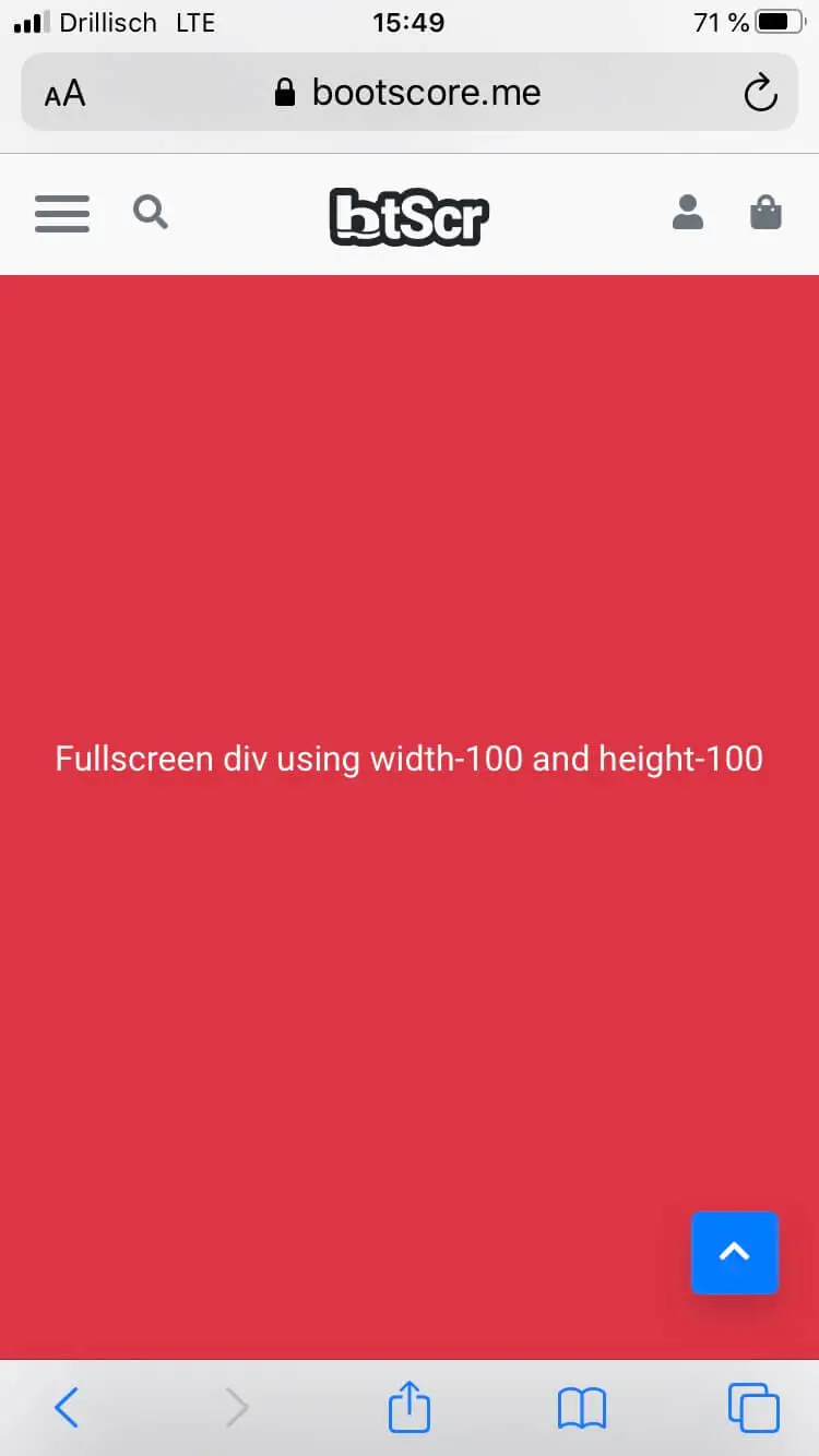
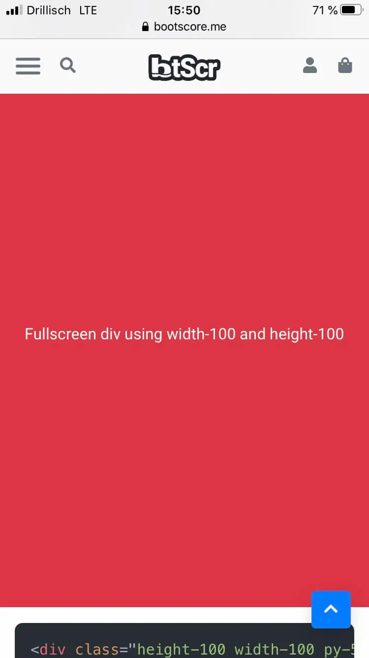
</div>Using both classes to create fullscreen elements
Fullscreen div using width-100 and height-100
<div class="height-100 width-100 py-5 bg-danger text-white">
  <div class="container h-100 d-flex align-items-center justify-content-center">
    Fullscreen div using width-100 and height-100
  </div>
</div>